
Leeds Glass Suppliers. Call our team on
Get A Fast Quote
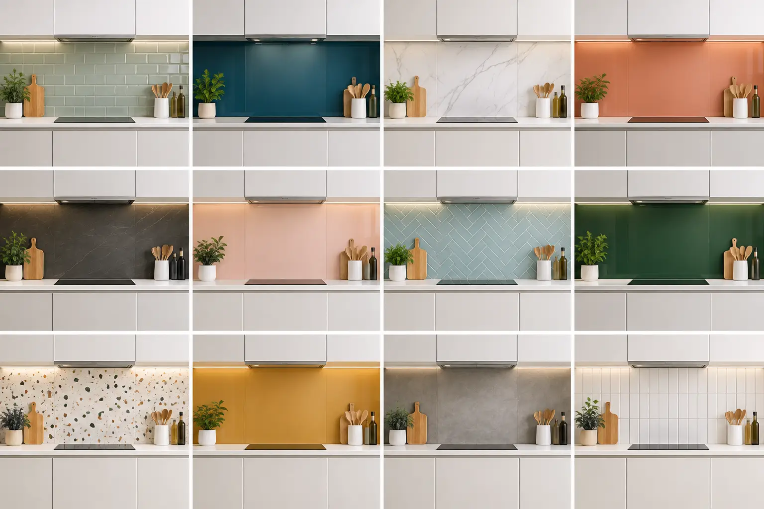
A kitchen splashback covers a relatively small area, but it sits right in your eyeline. That is why the best splashback colour ideas start with how the room is used, how much natural light it gets and the finish of the cabinets around it, not simply the shade that looks good on a sample card.
With toughened glass, you are not limited to the colours or tile formats available in a shop. A made-to-measure glass splashback can be colour matched, cut around sockets and extractor details, and finished as one clean, easy-to-wipe surface. It gives you far more freedom, but it also makes choosing the right colour worth a little thought.
Before settling on a splashback shade, look at the elements least likely to change: worktops, cabinet doors, flooring and appliances. A colour can be beautiful on its own and still feel out of place when it meets a strongly veined quartz worktop or warm oak cabinetry.
If your worktop has plenty of movement, such as marble-effect quartz or granite, a quieter splashback is usually the safer choice. Pull out one of the smaller tones within the worktop - a soft grey, mushroom, off-white or muted green - rather than competing with its main pattern. Where the worktop is plain, you have more room to introduce character through colour.
Also consider the undertone. Crisp white cabinet doors often suit cool whites, blue-greys and clean greens. Cream, stone and timber kitchens tend to sit more naturally with warmer whites, taupes, olive tones and softened blues. This is not a hard rule, but getting warm and cool tones working together is often what makes a kitchen look considered rather than pieced together.
Warm white is a useful alternative to brilliant white, especially in north-facing kitchens or rooms with timber, brass or cream details. It keeps the wall bright without looking clinical. On glass, this can be a very clean choice because there are no grout lines to break up the surface.
Ask to see the sample against your cabinet door rather than judging it under showroom lighting alone. Whites can look surprisingly different beside a cool grey worktop or under warm LED lighting.
Grey remains a practical option, but the best version is rarely a flat, cold mid-grey. Pale dove grey suits white and light wood cabinets, while charcoal creates a sharper contrast behind pale units. A mid-grey can bridge the gap between stainless steel appliances, quartz worktops and painted cabinetry.
The trade-off is that dark grey shows splashes and fingerprints a little more readily than paler shades, particularly behind the hob. Glass is straightforward to clean, but a lighter colour will be more forgiving between wipes.
Navy adds depth and looks particularly effective with pale grey, white, oak and handleless kitchen units. It has more warmth than black and changes character through the day, appearing almost inky in low light and richer blue in sunlight.
In a compact or poorly lit kitchen, use navy carefully. It can make a long run of wall feel heavier. It often works best as a focused splashback behind the hob, balanced by light worktops and cabinetry elsewhere.
Green has staying power because it works with both contemporary and traditional kitchen styles. Sage is gentle and adaptable, pairing well with white, pale grey, limestone and natural wood. Olive is deeper and more confident, especially with aged brass, walnut and cream painted cabinets.
Avoid choosing a green simply because it is currently popular. Look at the light in your own room. Some greens appear fresh in daylight but become muddy under very warm artificial bulbs. Taking a cabinet sample or photograph to compare colours in person can prevent an expensive near miss.
Teal sits between blue and green, giving it more flexibility than many brighter shades. It can bring energy to a neutral kitchen without becoming overwhelming, particularly when paired with white cabinets and a pale stone worktop.
A saturated teal splashback is a feature, so let it be one. Keep nearby accessories, wall paint and bar stools relatively restrained. Too many competing colours can make the kitchen feel busy, no matter how generous the room is.
Terracotta, burnt orange and clay shades work well in kitchens that need warmth. They complement oak, dark timber, off-white cabinets and matt black details, and can make a modern space feel less stark.
These colours are strongest when they have a slightly softened, earthy quality rather than a bright orange finish. If you like the idea but are not ready for a full run of colour, consider using it only behind the hob or on a smaller secondary wall.
Pink is not only for bold interiors. A muted blush, plaster pink or dusty rose can look smart alongside pale oak, stone worktops and brushed brass. It brings warmth without the visual weight of darker reds or browns.
This choice depends heavily on adjacent colours. Pink with a blue-grey can feel modern and crisp; pink with cream and warm timber feels gentler. A glass colour sample is particularly helpful here, as paint chips can make a shade look more muted than it will appear across a reflective surface.
A black glass splashback gives a clean, high-contrast look with white or pale cabinets. It is also a natural partner for black taps, dark appliances and dark-framed glazing. For a sleek handleless kitchen, it can be hard to beat.
However, black reflects the room and shows water marks more clearly than most colours. It suits homeowners who like a dramatic finish and do not mind a quick wipe-down. In a small kitchen, consider charcoal or very dark green if pure black feels too severe.
Matching the splashback closely to the cabinets produces a more continuous finish. This approach works well with deep green, navy, grey and neutral painted units, letting the worktop and fittings take more of the attention.
Exact matching requires care. Cabinet paints, laminate doors and glass all reflect light differently, so two materials with the same named colour may not appear identical. A specialist can help you compare samples and decide whether a close tonal match or a deliberately contrasting shade will look better.
When a worktop has veining, flecks or layered tones, selecting a secondary colour from within it often creates the most natural result. A white quartz with fine warm-grey veining could take a soft grey splashback; a darker stone with subtle green notes may suit olive.
This approach keeps the scheme connected without making every surface the same. It is especially useful where you want a bespoke finish but are unsure about using a strong standalone colour.
Colour is only one part of the decision. Glass has a natural reflective quality, so it can bounce light around a darker kitchen and make a narrow room feel more open. Pale shades maximise that effect, while dark colours create depth and a more dramatic focal point.
Think about what the splashback will reflect. Opposite a window, a dark glass panel may pick up garden views and daylight beautifully. Opposite open shelving, a busy wall or a bank of appliances, it may reflect more visual clutter than you expect.
Lighting temperature matters too. Warm white lighting can make cool greys, whites and blues appear softer or slightly yellow, while cooler lighting can flatten warm paint colours. If you are replacing kitchen lighting as part of the renovation, choose the bulbs before making a final colour decision where possible.
A glass splashback should fit the kitchen, not force the kitchen to fit a standard panel size. Accurate measuring matters around sockets, upstands, extractor hoods and uneven walls, particularly in older Yorkshire properties where few walls are perfectly square.
At Yorkshire Glass, splashbacks are made in the Leeds workshop to suit the individual space. That means you can discuss colour, dimensions, cut-outs and the practical details at the same time, rather than trying to adapt an off-the-shelf product once the kitchen is already installed. Toughened safety glass also gives you a durable surface behind the hob, subject to the correct specification for the appliance and installation.
For most kitchens, it helps to narrow your choices to two or three shades and view them alongside a cabinet door, worktop sample and a photograph of the room. The right splashback colour should still look good on a grey winter morning, under evening lights and after the kitchen has been properly lived in.