
Leeds Glass Suppliers. Call our team on
Get A Fast Quote
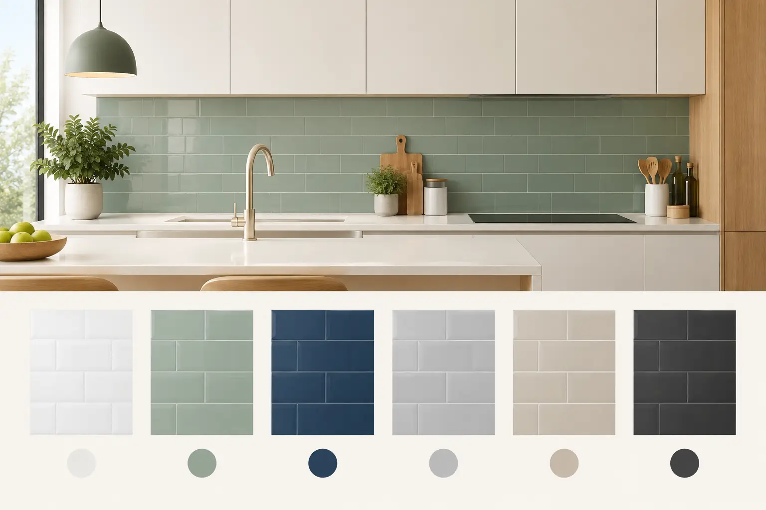
A kitchen splashback can look like a small part of the room on a plan, yet it often sits directly in your eyeline between the worktop and wall units. The right shade can make cabinetry feel sharper, warm up a cool scheme or give a simple kitchen a more finished feel. This kitchen splashback colour guide is designed to help you choose with confidence - not simply pick a colour you like on a small sample.
A made-to-measure glass splashback gives you far more freedom than a standard tile or panel. It can be matched closely to your kitchen, made in a bolder feature colour, or kept deliberately quiet so the rest of the room takes the lead. The best choice depends on the light, the worktop, the unit finish and how you want the space to feel every day.
Before choosing a splashback, look at the fixed elements of your kitchen. Repainting walls is straightforward. Replacing a stone worktop, fitted units or floor is not. These are the finishes your splashback needs to live alongside.
Take note of the undertone in each surface. A white kitchen is rarely just white: it may be bright and cool, creamy, greyed off or slightly pink. Likewise, a grey worktop might lean blue, green, brown or charcoal. Matching the undertone matters more than matching a named colour.
If you are unsure, bring a cupboard door, worktop offcut or clear photographs taken in natural light when discussing samples. Viewing shades side by side is much more reliable than trying to judge them from memory or from a screen.
Worktops tend to cover a large area, so they are a useful starting point. With white quartz or pale marble-effect surfaces, nearly every splashback route is possible. A soft grey, warm neutral or clean white gives a calm result, while deep green, navy or black creates stronger contrast.
With a heavily patterned stone or busy laminate, restraint often works best. A single-colour glass splashback can give the eye a resting place and stop the kitchen from looking overly detailed. Picking out one quieter tone from the worktop veining is usually more successful than attempting to match every colour in it.
Dark worktops can carry a pale splashback beautifully, particularly where there is good daylight. However, a pale panel behind a hob will show cooking marks more readily than a darker mid-tone. Glass is easy to wipe clean, but this is still worth considering if you cook often.
Pale shaker units work well with both traditional neutrals and more contemporary colours. Sage green, muted blue and warm grey glass can add interest without making the room feel fussy. For a bolder look, a darker splashback behind a range cooker or hob can create a smart focal point.
With dark cabinetry, a splashback does not have to be white to keep the room from feeling enclosed. Soft putty, pale taupe, dusty blue and light olive can all bring lift while feeling less stark than brilliant white. In a large, bright kitchen, a near-black or dark bronze splashback can look particularly considered.
For wood-effect units, check whether the timber reads warm or cool. Oak-style finishes often sit well with cream, mushroom, olive and deep green. Cooler ash or grey oak can suit soft grey, blue-grey and charcoal. A warm colour against a cool wood finish can still work, but it should be a deliberate contrast rather than an accidental mismatch.
Once you have considered the fixed finishes, think about the atmosphere you want from the kitchen. Colour changes the character of a room as much as its appearance.
White glass splashbacks are popular for good reason. They keep a smaller kitchen open and bright, work with many cabinet styles and are unlikely to date quickly. Pure white suits crisp, modern kitchens, while warmer whites are more at home with timber, brass details and cream cabinetry.
The trade-off is contrast. A bright white splashback beside an off-white worktop or yellow-toned unit can make both shades look wrong. If the kitchen already has warmth, consider ivory, stone, cashmere or a very pale greige instead.
Soft neutrals are often the safest choice where the kitchen needs to appeal to different tastes, such as a rental property or development. They are flexible, calm and easy to update with paint, stools and accessories later.
Grey remains a practical middle ground, particularly for contemporary kitchens. Light grey can soften bright white units, while darker graphite shades sit well with black handles, dark appliances and concrete-look worktops.
But grey is not automatically neutral. Blue-grey can feel cold in a north-facing kitchen, especially with cool LED lighting. A warmer greige or taupe-grey may give the same understated effect with more comfort. Always view samples in the actual room at different times of day.
Greens and blues are excellent choices when you want colour without the intensity of red, orange or bright yellow. Deep forest green pairs well with brass, oak and pale stone. Sage offers a softer, relaxed look, while olive feels grounded and works especially well in period homes and modern country kitchens.
Navy and inky blue create a clean, confident backdrop for white or pale grey units. Mid-blue can be more playful, but it needs careful consideration because it has a stronger visual presence across a large run of glass. If you love the colour but are hesitant, use it behind the hob and choose a quieter tone elsewhere.
A dark splashback can make a kitchen feel tailored and high-end, particularly when paired with matching dark worktops or black-framed details. It is also forgiving around cooking areas, where splashes are less noticeable between cleans.
The downside is that dark glass reflects light differently. In a small kitchen with limited daylight, it can create a heavier feel. This is not always a reason to avoid it - under-cabinet lighting and a lighter worktop can balance the effect - but it is a choice to make knowingly.
Bright colours can be very effective in the right setting. A red, cobalt, mustard or vivid teal splashback can turn simple units into something much more individual. The key is to give the colour enough space and avoid competing patterns nearby.
Ask yourself whether you enjoy the colour in a room you use daily, rather than whether it looks striking in a photograph. A bespoke splashback is built to last, so it is worth choosing a shade you will still enjoy after the novelty has worn off.
A painted glass splashback has depth and shine that a digital image cannot properly show. Its appearance also shifts with the room around it. Daylight, pendant lights, under-unit lighting and the colours opposite the kitchen all affect what you see.
Gloss glass reflects more of its surroundings, which can make a colour appear brighter and more lively. This can help bounce light around a compact kitchen, but reflections may be more noticeable. If a softer, less reflective finish is preferred, discuss the available glass and finish options before finalising the specification.
Lighting temperature is just as relevant. Cool white bulbs can make grey, blue and white splashbacks appear crisper, sometimes harsher. Warm white lighting brings out yellow and red undertones, making creams, woods and warmer greens feel richer. Check your chosen sample with the lights you plan to use.
Open-plan homes need an extra layer of thought. The splashback may be visible from the dining or living area, so it should relate to the wider palette. A deep green might echo a sofa or houseplant-filled space; a soft neutral may allow artwork and furnishings to take the focus.
In a separate kitchen, you can be more independent. A vivid or dark splashback can create its own moment without needing to coordinate with every adjoining room. This is often where homeowners feel most comfortable choosing something more personal.
Also consider metal finishes. Chrome generally suits cooler whites, greys and blues, while brushed brass and bronze often flatter warm neutrals, greens and earthy tones. These are guidelines rather than rules, but a splashback that acknowledges the tap, handles and lighting usually looks more intentional.
Colour is only one part of a successful splashback. Accurate measuring is essential, especially around sockets, extractor hoods, uneven walls and unusually shaped areas. Toughened safety glass is normally required behind a gas hob, and cut-outs must be planned before toughening because glass cannot be altered afterwards.
Ask for a sample or see colours in person where possible. Confirm the final shade, glass type, dimensions, cut-outs and fitting arrangement before manufacture. This matters even more for a colour match to paint, cabinetry or an existing feature, as variations between materials and lighting are normal.
Yorkshire Glass manufactures bespoke splashbacks in Leeds, so the team can help with practical choices as well as colour, including unusual sizes, shaped pieces and detailed cut-outs. Bringing your ideas and samples into the showroom can make the final decision far easier.
The best splashback colour is the one that still feels right when the kitchen is busy, the daylight has changed and dinner is on the hob. Choose a shade that works with the finishes you already have, then trust your response to the sample in your own space.